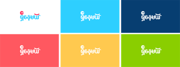
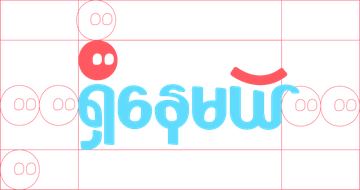
Logo Geometry and spacing of the Logo design
Once the conception of Shii Nay Mal was born, it was the turn to develop a dynamic Logo that captures the emotional diversity that youth wanted to share with the audience.
The Shii Nay Mal Logo was born based in Myanmar characters, which allowed a clear dynamic expression of emotional reflections and topics through the colours and patterns.
For the logo, this is the minimum amount of space to leave around the logo before you reach the edge of the page or other elements. It can be work out at any logo size by allowing the size of the longyi-tin head — two across horizontal and one vertical on each side.

Average Rating: ☆ ☆ ☆ ☆ ☆ (0 reviews)


